 This is a poster and flyer for a house music event, The imagery used in the poster is my own photography from inside a glacier in the french alps. I really like the colour and the shapes of the ice, that is the main feature to my design.
Monday, 8 February 2010
+359


 This is a re-design of a Bulgarian wine by the Graphic Designer Jordan Jelev. The original artwork for this bottle was screen-printed by Rotoprint in Bulgaria. The colours in this design is really different to usual wine designs and the type used has great large round serifs which i think gives it an interesting look. The texture on the type is created by a uv varnish and puff up varnish, this gives the label an extra touch of class in a very modern design.


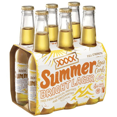
 This is packaging for a lager from XXXX which is based around being a summer drink which is enjoyed in a hot climate. The lager is a very light lager and is inspired from beach culture. This is shown very well in the design. The hand drawn relaxed illustrated style really shows this. The design is informal and this suits the type of product it is. I personally like the way the type is nearly the same colour as the lager itself, very subtle design.
Subscribe to:
Comments (Atom)